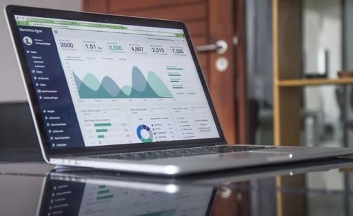
A bad dashboard is like an inconvenient car dashboard: it can distort data, mislead the user, and seriously slow down decision-making. Good – highlights important data, focuses the user on the main thing, helps to make decisions quickly and efficiently, to recognize risks and opportunities for growth in time.
How to design a good dashboard for mobile and desktop – in our article.

Contents
Dashboard design algorithm
Dashboard design is a discipline at the intersection of analytics and design. A developer, a BI-analyst, must find out what tasks a product manager needs a dashboard for, and based on them, propose a solution. It is impossible to say in advance that there are ready-made solutions for specific metrics, so each time it is necessary to find out the user’s needs.
Let’s consider the most important components.
#1. Team. First, we figure out who is involved in solving the problem, who is responsible for what and who has what expectations. Because often BI analysts are required not only to visualize, but also to prepare data.
2. Understanding the task. At this stage, it is necessary to describe how our business and the specific division for which we will create a dashboard work. The goal is to synchronize the vision of the situation and the task.
3. Users. Now you need to find out who will use the dashboard, what user roles will be in it (head of sales, sales managers, or test team).
4. Questions and business decisions. Here you need to understand what business decisions users will make based on the visualized data and what questions to look for answers to.
5. Context and formats. In this block, it is necessary to describe when and in what conditions users watch the dashboard, what devices they use.
6. Data. After that, we define the data structures, find out what data is already there and what is to be collected.
7. Formats. When we have a data structure and a context for using dashboards, we can think over the formats: whether there will be a mobile version, which charts and indicators will be located higher and to the right, and which ones will take fewer priority positions.
8. Layout. At this stage, we draw the sketch of the future dashboard, arrange the blocks and graphics relative to each other, and then make a layout.
9. Testing and support. Collecting feedback from users and finalizing the dashboard.

Dashboard layout principles
The dashboard layout is a relatively simple process if you understand the business task and the importance of elements relative to each other. For this, classic design techniques are used. For example, contrast rule and F-pattern-read:
- F-pattern reading – that is, people in our country read from left to right and from top to bottom.
- Contrast Rule – Despite the importance of the F-pattern, our attention is especially drawn to large and bright elements.
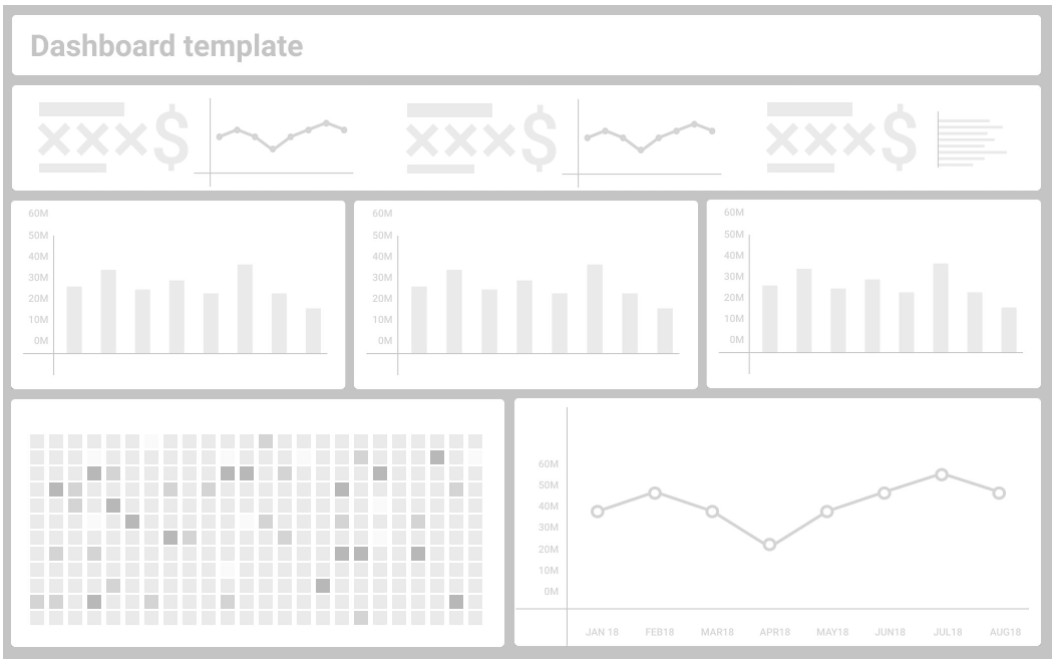
Basic principles: the most important thing is put at the top left – and this main thing should be large. And the most unimportant is put lower, to the right, and should be smaller. This is how you can control the user’s attention on the dashboard. According to research, this is how people learn dashboards.
The layout is rather mechanical and routine work, but it requires care and accuracy. And the main thing is that there is an understanding of what is more important – then the designer simply fills the space of the dashboard from top to bottom and makes the more priority elements larger.
Desktop and mobile versions of the dashboard
To understand how the desktop and mobile versions of the dashboard should differ, it is important to understand the context of interaction (how often and in what situation we interact with the dashboard) and its format (mobile or desktop, etc.).
While in the enterprise, mobile dashboards are a rarity. One of the reasons is data security problems: how to transfer secret information to a smartphone, implement a secure protocol on mobile devices so as not to compromise them. However, mobile versions of dashboards are also made. They are mainly needed by field employees – sales managers, merchandisers, supervisors.
When the task is to make two dashboards for different formats, you need to seriously work out each version, and not just copy them.
Usually, these two versions of the dashboard differ only in that everything unnecessary has been removed from the mobile. To understand how to design a mobile dashboard or how to adapt a dashboard for mobile devices an important nuance must be taken into account: just rearranging the blocks in places and getting the same cool and convenient dashboard as in the desktop version is almost impossible – some visualizations on a small screen will simply not work out normally.

In what tools to create dashboards
Different tools are suitable for different tasks:
- Tools for exploring data and presenting results as a set of graphs. These are “research” programming languages and notebooks (R, Python, etc.). Suitable for quick analysis and complex analytical calculations. Most often these are one-time tasks.
- Tools for simple dashboards and quick analytics. These are mainly cloud BI systems such as Excel, Google Data Studio, QuickSight, Grafana. The user can simply connect to them and independently pull, visually display and view the necessary data.
- Tools for operational and regular reporting. These are modern BI platforms: Tableau, Power BI, Qlik. These “industrial” tools have a good balance between development cost and report quality.
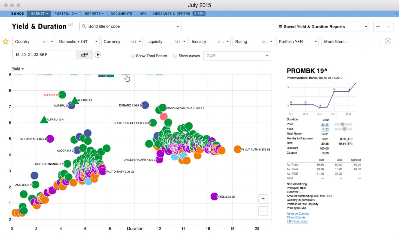
- Front-end languages and libraries for creating complex analytical tools or dashboards with a large user reach. These are JS, d3.js, highcharts.js, etc. Suitable for complex custom analytics like securities market or data from biotech.

When is it time to make a dashboard?
There is a good approach: a great way to understand what a person has in his head is to look at his operational dashboards; if there is a mess, there are no answers to basic questions, then it’s the same in my head.
In this sense, the dashboard really helps to understand how you think, what are your goals in the product. And the process of designing a dashboard perfectly structures thoughts and allows you to figure out what you need to do at work. From this point of view, the dashboard should be designed as early as possible, because as a result of this process it will be possible to clarify the goals and objectives of the team.
